|
Welcome to my data visualization page!
One of my favorite parts of my job is working on the visual representation of social and economic data. Below you'll find some visualizations for different research projects I am involved in. My intention is to make some of the work I do more accessible to a non-specialist audience as well as to folks who want to see more interactive versions of the results I produce in my research. |
Wage Inequality Across U.S. Cities
|
This interactive map was made using the Shiny R package and is based on data I have put together for a new project. This research examines the relationship between a city's population density and its levels of gender and racial wage inequality. You can click on individual circles to see the exact size of the wage gap (with confidence intervals) and how wage inequality in a city compares to other cities. Wage gaps were calculated separately for each city (with an OLS regression) using pooled Decennial Census and American Community Survey data for the years 2000 and 2014-2018. They reflect differences in (inflation adjusted) hourly wage and salary income (aggregated up to annual values) for year round workers who made at least $1,000 in the previous year, after controlling for education, hours worked, age, age squared, nativity, and marital status. If a value is labeled "NA," it means the inequality comparison was not statistically significantly different from 0. Data are at the Metropolitan Statistical Area level.
Data sources: IPUMS USA, University of Minnesota, www.ipums.org; IPUMS NHGIS, University of Minnesota, www.nhgis.org ***Works best on larger screens |
|
|
Immigrant Diversity Across U.S. City-Regions 2017
|
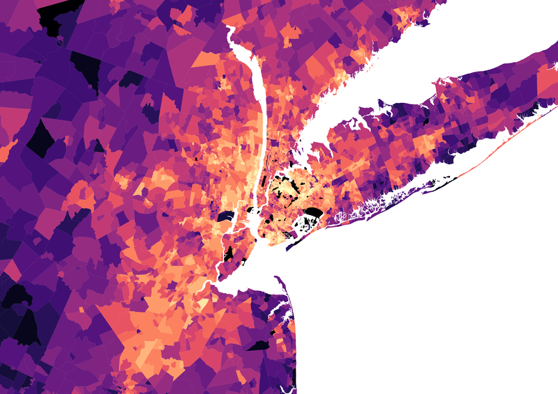
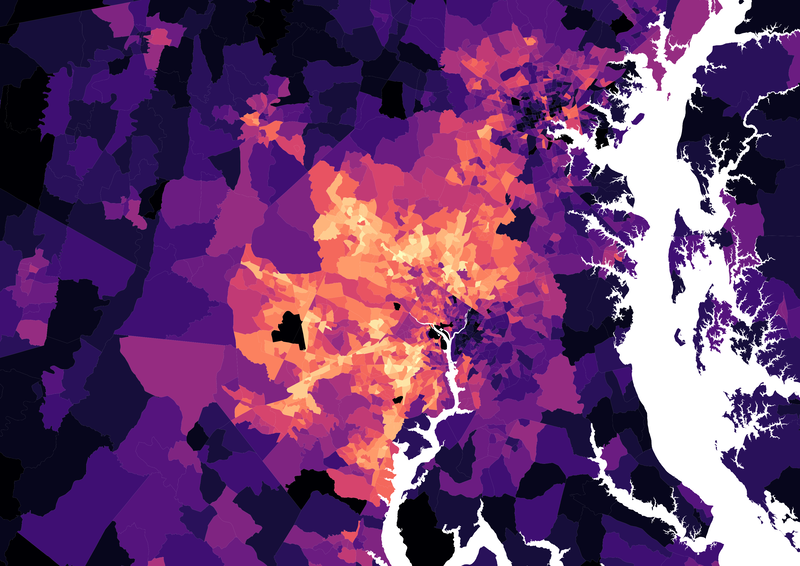
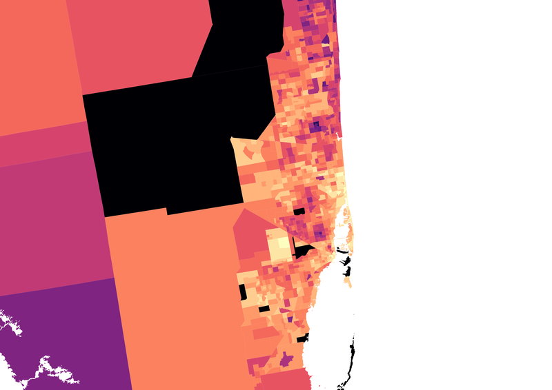
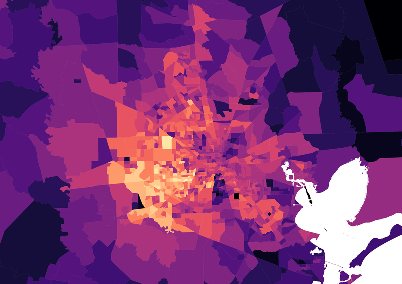
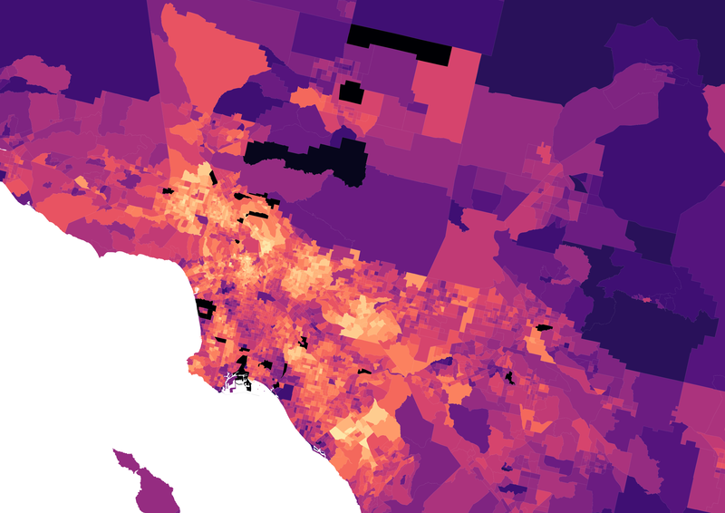
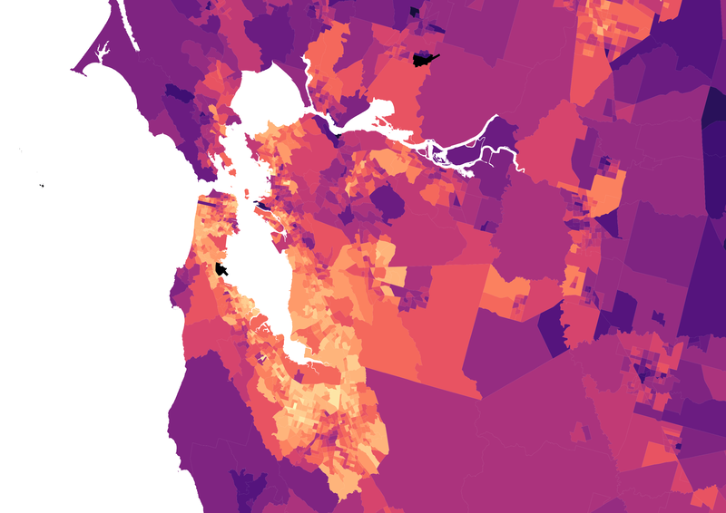
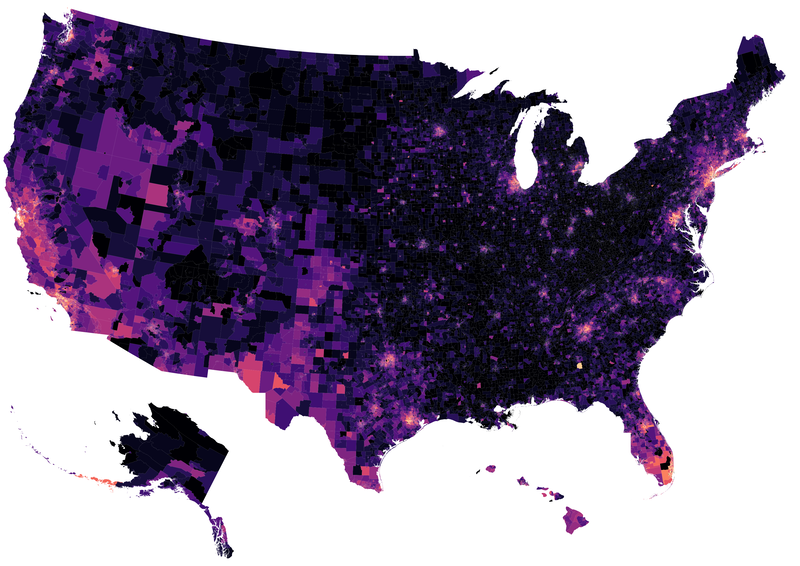
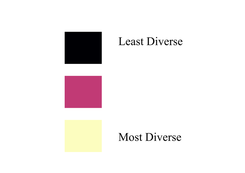
These maps display population diversity in terms of country of birth across U.S. census tracts in 2017 (with 5-year American Community Survey data). Diversity is measured with an entropy index. Researchers often use census tracts as a proxy for neighborhoods. Many of the most country of birth-diverse census tracts are in these 6 cities. This data is based on research I have done on the relationship between immigrant diversity at the urban level and workers' wages. You can click on each image to see them more closely.
|
|
|
|
|
Population Growth Across U.S. States
|
The GIF below shows the percent population growth across U.S. states from 1950 to 2010. This was created as part of a research project where I am looking at the causes of out-migration from "superstar" U.S. cities (specifically Los Angeles, San Francisco, Seattle, Boston, New York, and Washington, DC). A common concern in the media as well as among policymakers is that high housing costs in these cities are pushing workers out and into entirely new city-regions. However, at the same time that push factors like cost-of-living are undoubtedly at play, it is important to remember that there has been substantial economic growth outside these cities in recent decades, particularly in traditional blue-collar jobs like manufacturing. Consequently, there has been massive population growth in a number of states that together form what is often called the "sunbelt," outlined on the map in red. In this research I ask whether low socioeconomic status as well as Black and Latinx households (who research on gentrification has shown are particularly vulnerable to displacement within cities), are getting pushed out of these city-regions into entirely new regional labor markets by the high cost-of-living. I find that lower socioeconomic status households are indeed slightly more likely to leave these cities (though Black and Latinx households are more likely to stay compared to white households), but that their out-migration reflects movement to places with rising economic opportunity, particularly for workers without college degrees, as well as to places with lower cost-of-living. Migration out of these cities is thus more complex than simply the push of high cost-of-living.
|
 |
